
Designing a B2B website for different levels of product knowledge
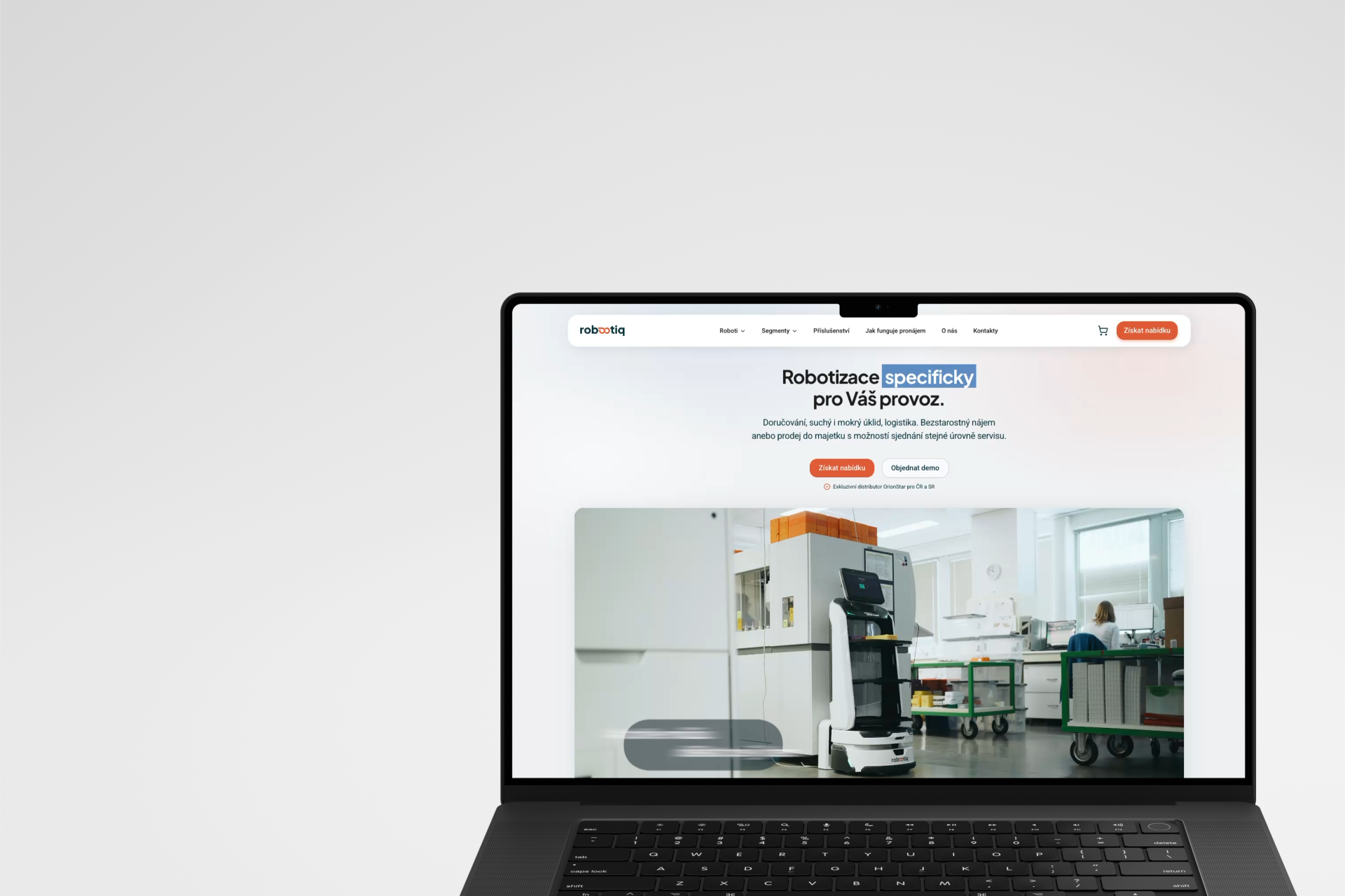
UX/UI Design • B2B • responsive web design • 2026
Robootiq had a broad portfolio of robotic solutions for different types of businesses and operations. Some customers arrived with a fairly clear idea of what type of robot they were looking for. Others only knew they wanted to make cleaning, logistics, or another part of their operation more efficient.
I led the UX/UI design of the new website, from discovery and information architecture through user flows and wireframes to responsive UI, client communication, and close collaboration with the developer during implementation.
This case study focuses on one of the project’s key design decisions: how to design a website for two different starting points while making robotic solutions understandable to people who don’t yet know exactly what they need.
Context
A broad portfolio for customers with different levels of knowledge
Robootiq provides robotic solutions for a variety of businesses and operations. Its portfolio includes several brands, types of robots, accessories, and solutions applicable across different industries.
At the start of the project, there was no existing website to redesign. The client already had an established business, customers, and a product portfolio, but needed a new digital experience that could present the offering clearly and guide visitors towards a relevant solution, demo, or enquiry.
During discovery and while working on the structure of the offering, it became clear that customers weren’t arriving with the same level of product knowledge.
Some already knew:
Others were thinking more along the lines of:
“We need to make cleaning in our hotel more efficient.”
Both could ultimately be looking for the same solution. They just needed different ways to get there.
Problem
A product catalogue alone wasn’t enough
The simplest approach would have been to structure the website around the product portfolio and let customers choose a category, brand, and specific model.
But for someone who was still trying to solve an operational problem, a list of cleaning robots and technical specifications would provide little guidance. They first needed to understand where robotics could be useful, what benefits it could bring, and which type of solution might be relevant to their situation.
At the same time, we didn’t want to make the journey more complicated for experienced customers who already knew exactly what they were looking for.
This led to the project’s main UX question:
How might we help an experienced customer get to a product quickly while helping a less informed visitor understand the solution in the context of their operation?
Solution
Two paths to the same offering
Instead of building the website around a single product hierarchy, I structured it around two ways customers approached the problem.
Those who already knew what type of robot they were looking for could go directly through the product portfolio:
Customers who were starting with an operational need could enter through their industry:
Industry → operational need → automation opportunities → relevant solution
Both paths eventually converged on the same product portfolio. Industry pages linked to relevant robots, while product pages showed where and how each solution could be used.
The goal wasn’t to create two separate navigations, but two paths to the same offering.
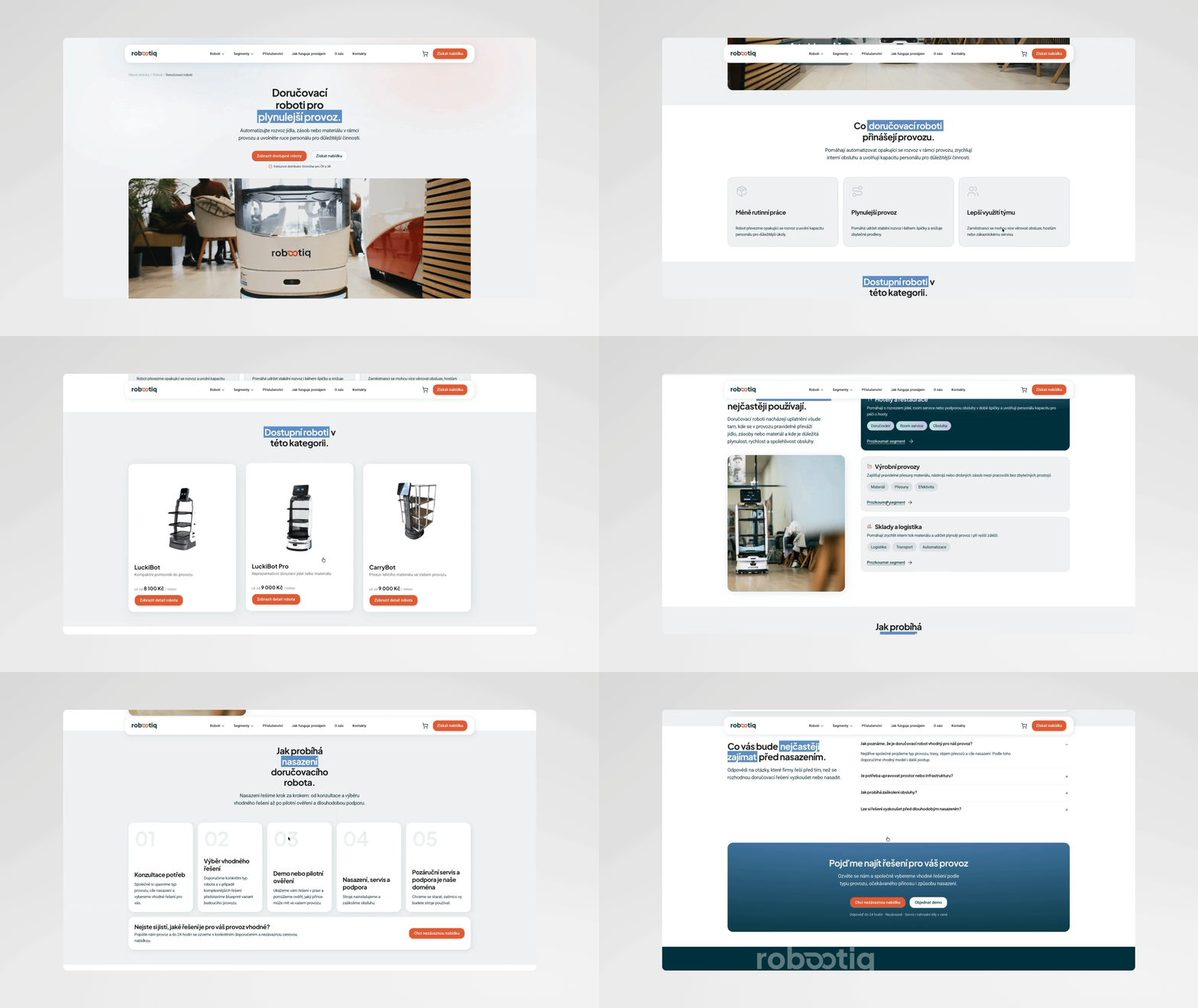
Different levels of knowledge required different stories
The difference wasn’t limited to navigation. It also influenced the order in which information was presented on individual pages.
On an industry page, we couldn’t assume that visitors already understood the robotic solution. The page therefore started with the context of their operation, its needs, and the potential benefits of automation before introducing specific products.
context → need → benefit → application → relevant solution
On a product page, on the other hand, we could get to specific information much faster:
product → application → benefits → solution details → next step
The same portfolio could therefore accommodate different levels of customer knowledge rather than expecting everyone to follow the same decision-making process.
From finding the right solution to taking the next step
Both paths ultimately led towards requesting a demo or making an enquiry. We didn’t want this step to be reduced to a generic contact form either.
Before submitting an enquiry, users could work with a specific robot, its configuration, indicative pricing, available service options, and accessories. The enquiry therefore built on the decisions they had already made while giving the sales team more context about what the customer was looking for.
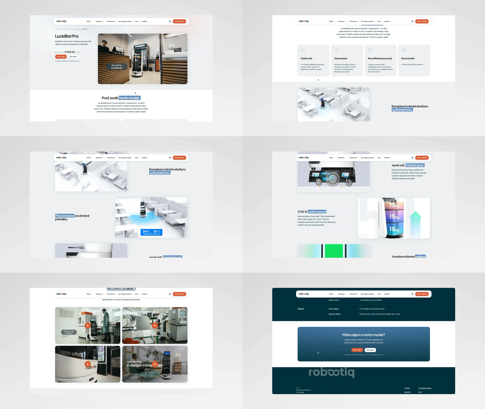
UI & implementation
From an initial visual direction to a live website
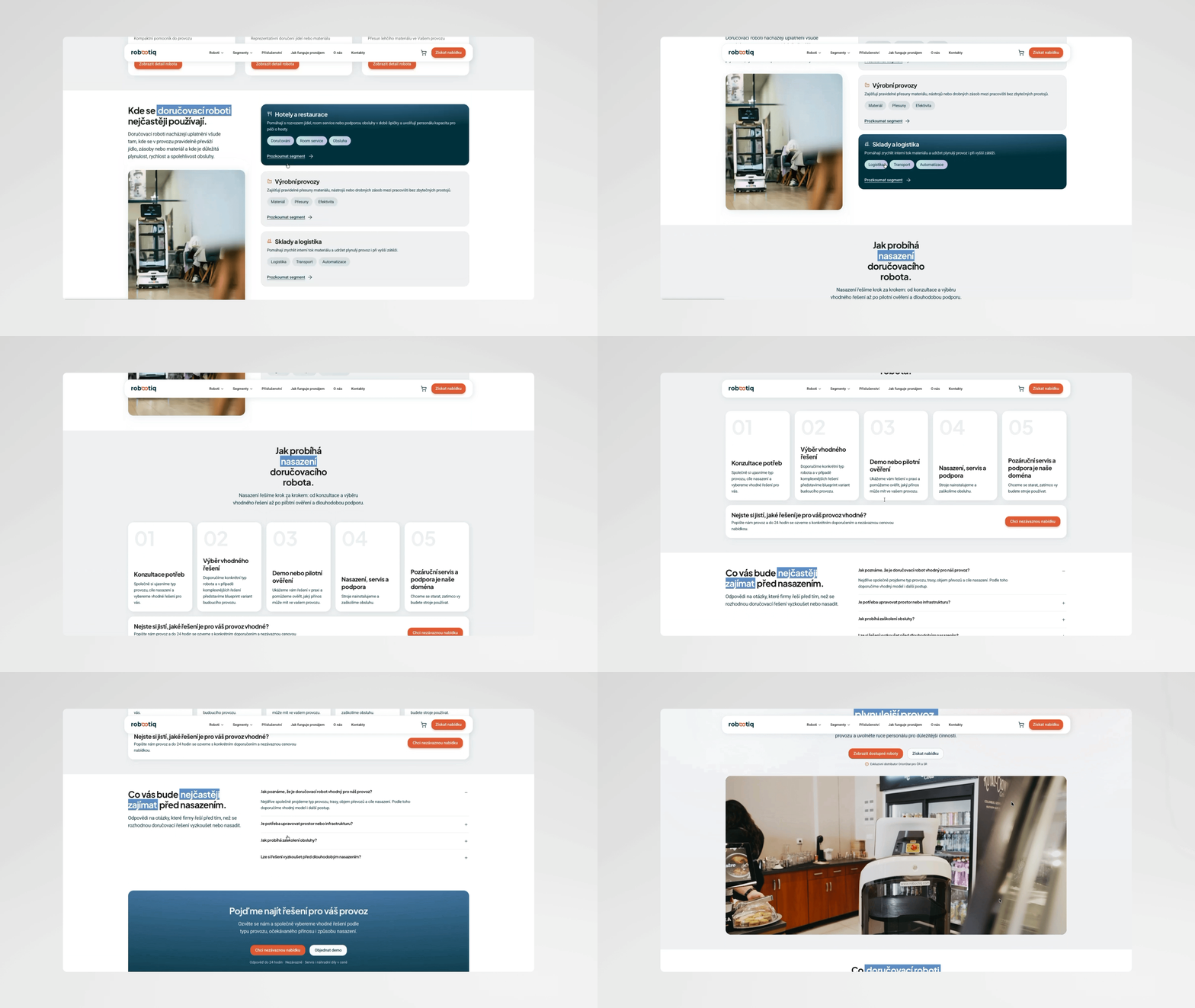
The logo, core colour palette, and initial visual direction had been created before I joined the project. My role was to translate that foundation into a consistent digital experience that could work across product pages, industries, brands, and the enquiry flow.
I designed layouts, components, content patterns, and responsive behaviour. I also worked closely with the developer throughout implementation, addressing real content, edge cases, responsive states, and situations that only became apparent once the designs were being turned into a working website.
For me, the design process therefore didn’t end with a Figma handoff. It continued until the individual parts worked together in the actual product.
Outcome
A website for customers starting from different places
The result is a live B2B website that allows customers to enter the offering based on what they already know about robotic solutions.
An experienced visitor can quickly navigate to a specific type of robot. Someone who is still looking for a solution to an operational need can start with their industry, understand the opportunities for automation, and gradually find relevant products.
Both paths converge on the same portfolio and continue towards a demo or a specific enquiry.
The website is now live, serves as the client’s main digital presentation of its offering, and generates customer enquiries.
I continued working closely with the developer throughout implementation to make sure the experience held together beyond the design files.
What I’d do differently today
On a similarly complex B2B project, I would connect information architecture and final content development much earlier in the process. The copy continued to change relatively late in the project, which also affected some UX decisions.
I would also define more explicitly at the beginning which parts of the design process we needed to protect and where we could deliberately simplify in order to meet a fast time to market.