
Mobile Application to Support People with Borderline Personality Disorder
The goal of this project was to design a mobile application aimed at supporting users with borderline personality disorder (BPD) through training in dialectical behavior therapy (DBT) skills, presented in an accessible and user-friendly environment.
- My role: UX designer, UI designer, researcher, concept author
- Duration: 6 months (2022-2023)
- Project: Bachelor’s thesis
Problem Definition
People with BPD often face intense emotional swings, impulsivity, and relationship difficulties that significantly affect their daily functioning. Dialectical Behavior Therapy (DBT) has proven to be an effective approach to treating these challenges. However, its availability in the Czech Republic is limited, and outside therapy sessions, there is a lack of tools for continuous support.
Digital support could help users retain and apply learned skills in everyday life. Currently, there is no app on the Czech market dedicated to this need, and most foreign apps are often overwhelming, confusing, and may not respect the cognitive load specific to BPD users. They require an environment that feels calm, clear, and safe, not another tool that adds stress.
The challenge was to design an application that:
- does not feel overwhelming,
- remains intuitive even in crisis situations,
- supports users without moralizing or pressure,
- allows flexible use without information overload.
For potentional stakeholders (therapists, researchers, or potential eHealth developers), such a tool could extend therapeutic intervention beyond sessions and improve adherence to DBT. This project therefore opens the door to combining digital and therapeutic tools in the mental health field.
Research
To better understand the needs of people with BPD and how they do (or don’t) use digital tools, I used a combination of research methods—from literature review to competitive audit and interviews with the target group.
Literature Review
I mapped available studies on digital interventions for people with BPD, focusing on DBT-based applications. I paid attention to which design principles proved effective and where they often failed. The review helped me create a design framework grounded in evidence-based psychological principles.
Competitive Audit
I analyzed 7 existing apps for mental health, DBT, or directly BPD (e.g., DBT Coach, Clarity, BPD Tracker, VOS, Woebot, Nepanikař). I evaluated usability, language, clarity, and content type.
Key issues I wanted to avoid:
- overwhelming or chaotic interfaces,
- overly technical or detached language,
- gamification that creates unpleasant pressure,
- low trustworthiness (missing context, authors, or references).
Semi-Structured Interviews (n = 5)
I conducted interviews with people currently enrolled in a DBT program. I focused on their experiences with digital tools, expectations, needs, and limits.
Insights revealed that while most participants had a positive attitude toward digital tools, usage often failed due to overload, lack of trust, or poorly handled tone of communication.
User needs:
- Quick and calm access to tools during crises
- Simple and clear interface without distractions or notifications
- Ability to practice DBT skills anytime, without relying on a therapist
- Safe space without performance pressure; gentle guidance instead of gamification
- Trustworthy and understandable content, ideally validated by professionals
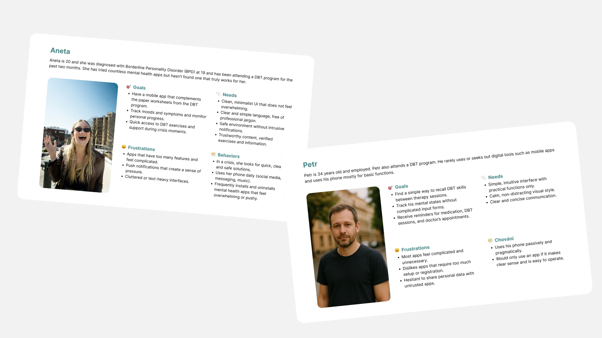
Personas & Empathy Map
Based on research, I created two personas representing different approaches to technology and DBT skills. Both reflected typical BPD traits: sensitivity to overload, need for safety, focus on trust, and low tolerance for invasive or moralizing tools.

Ideation
To ensure the app design matched real user needs, I combined creative and analytical ideation methods.
Crazy 8s
Used for quickly sketching various options for the app’s home screen. Goal: explore ways to greet the user while ensuring clarity, calm, and simplicity.
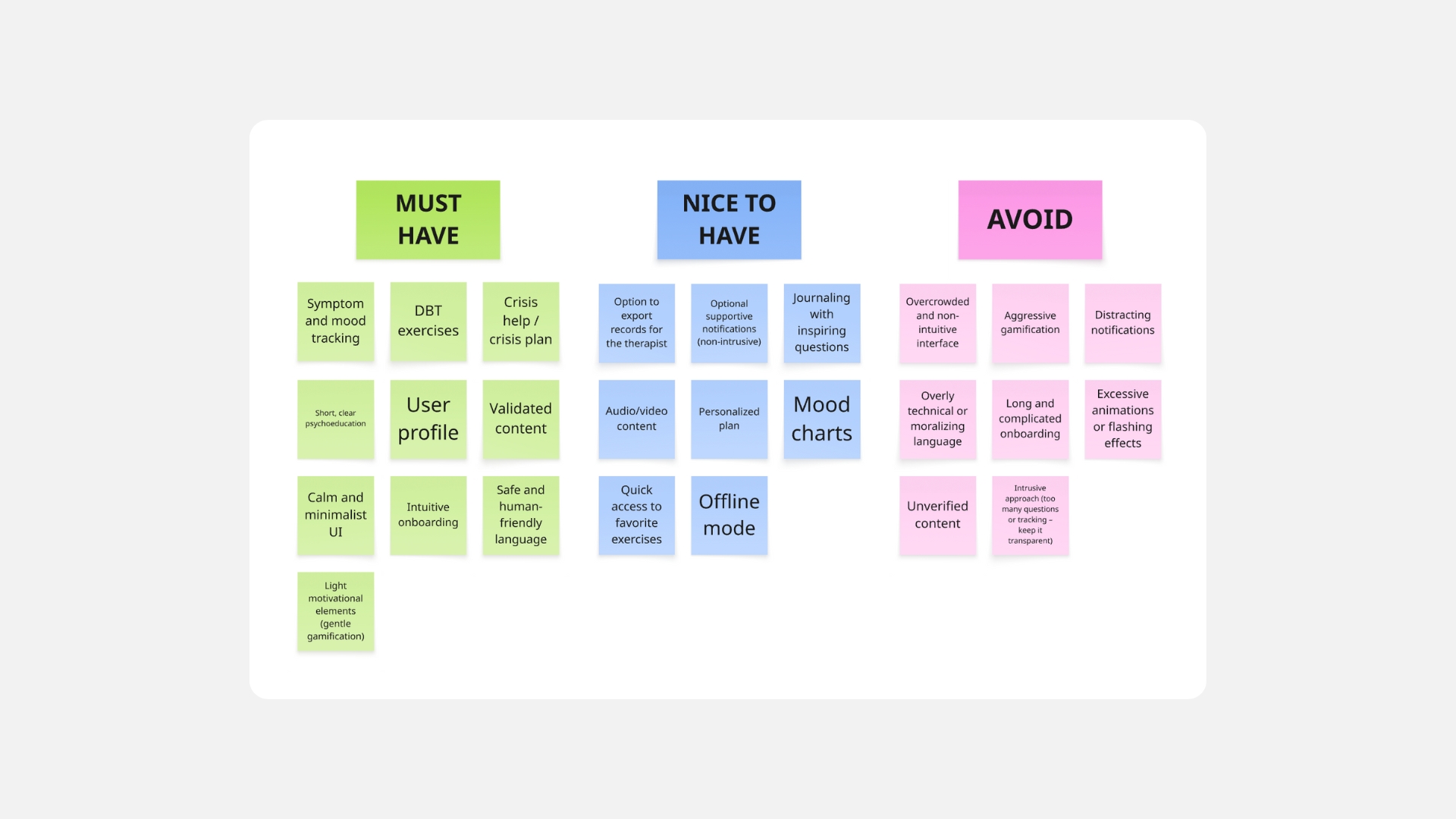
Affinity Diagram
I grouped outputs from brainstorming, research interviews, and competitive analysis to answer:
- What is essential for the app to fulfill its purpose?
- What can be useful but must not distract?
- What might be problematic for BPD users and requires careful handling?
Key takeaways included avoiding:
- overly performance-driven gamification,
- overly complex screens or cluttered navigation,
- distracting notifications or excessively “cheerful” tone without context.
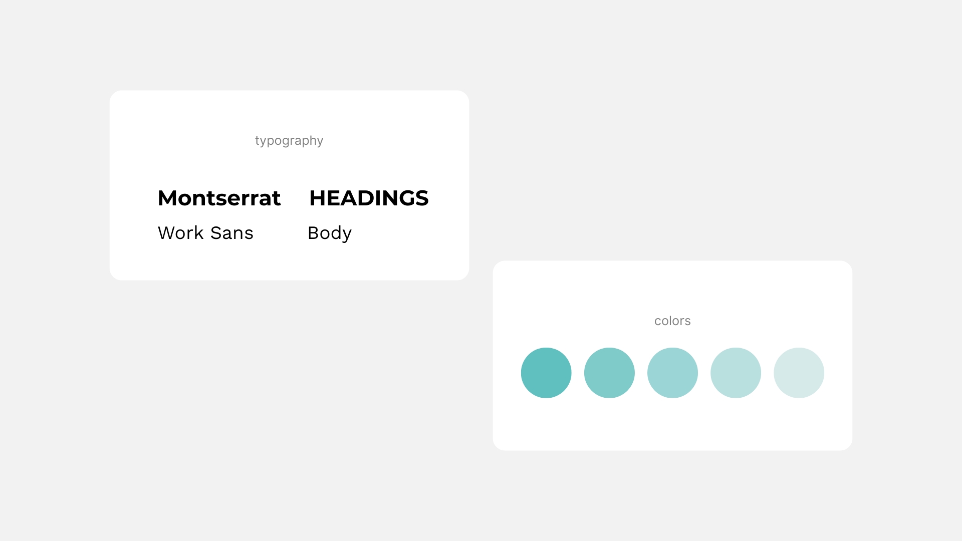
Visual Style & Interface
Visual choices were made consciously to suit the needs of people with BPD:
- Colors: neutral, soft shades of blue without harsh contrasts
- Typography: soft and highly legible
- Layout: simple, predictable, no unnecessary animations or effects
Every visual element was evaluated through the lens of cognitive and emotional load.
Design & Prototyping
I followed an iterative design process, moving from sketches to wireframes to a final high-fidelity prototype.
Lo-Fi Wireframes & Initial Testing
I created simple black-and-white wireframes in Figma to define navigation and basic functionality. Those wireframes were then tested with 3 users from the target group.
Key feedback:
- Need for simplified texts
- Crisis section needed clearer focus and visual anchors
- Users preferred microcopy and icons for easier orientation
Iteration
Adjustments included:
- Replacing expert terms with natural, user-friendly language
- Reorganizing screen layouts to keep essential functions at hand
- Adding microcopy and visual cues for calm navigation
- Adjusting color contrasts for accessibility
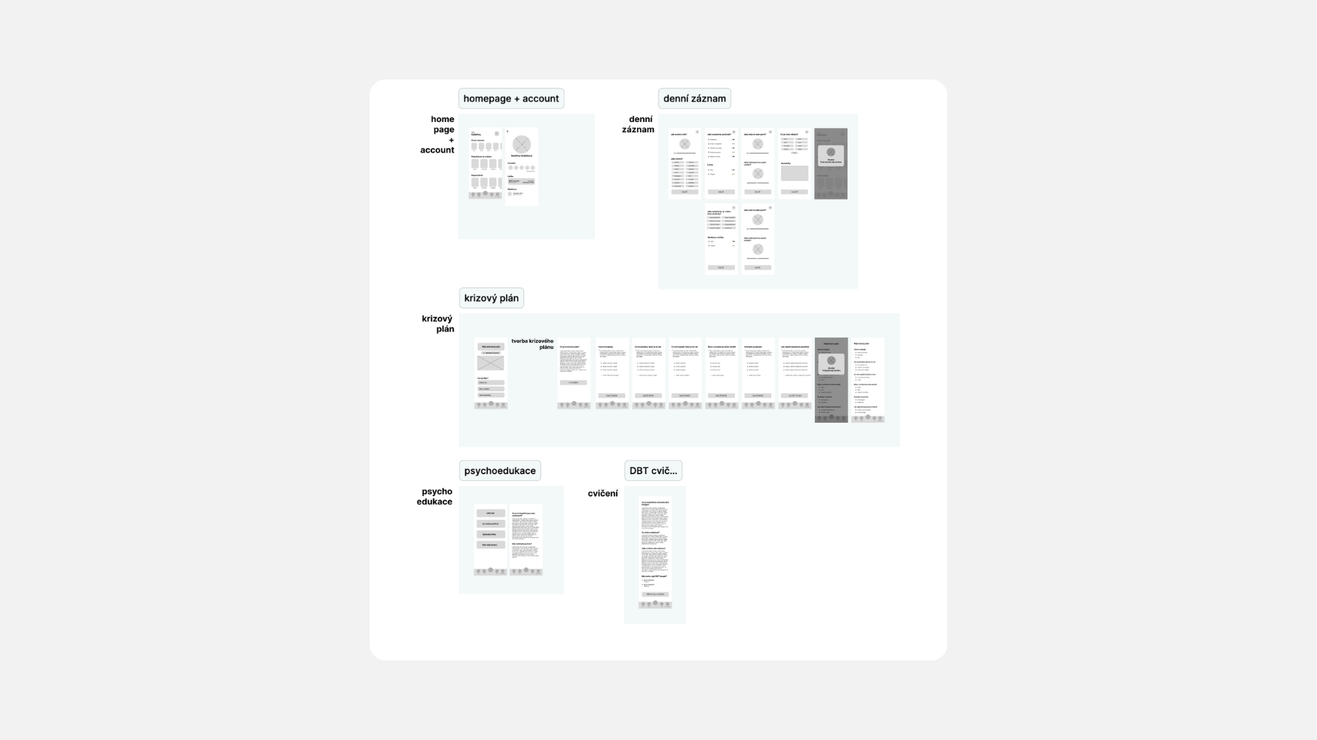
Hi-Fi Wireframes & Interactive Prototype
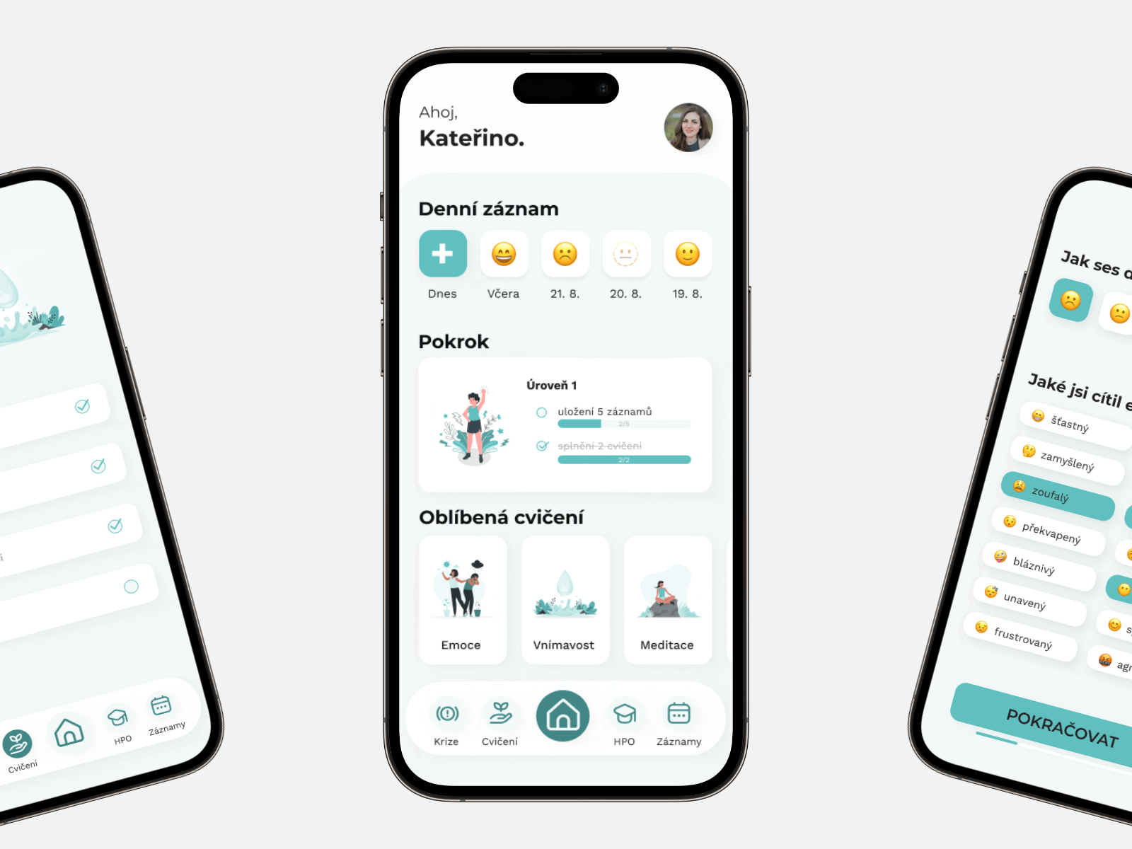
Final prototype included these core features:
- Mood & Symptom Tracking – simple trackers for moods, symptoms, and activities
- DBT Skills – clearly described exercises and skills
- Crisis Help – accessible support options (breathing exercises, SOS contact)
- Psychoeducation – short, easy-to-read articles explaining DBT principles
- User Profile – activity tracking without competitive elements
- Gentle Gamification – supportive, non-intrusive
Feel free to explore the prototype at this link. The app was designed in Czech, so the text is currently only available in Czech.
Testing & Iteration
Qualitative Usability Testing
- 4 participants from the target group tested the prototype
- Observed interactions + semi-structured interviews
Positive feedback:
- Simplicity and clarity of interface
- Easy access to crisis help and clear crisis plan setup
- Calm and non-intrusive design
- Mood and symptom tracking perceived as helpful
Areas for improvement:
- Some texts still felt “therapeutic”, users preferred more natural tone
- Crisis plan section needed extra labels and content separation
- Users wanted favorites or recent exercises for faster access
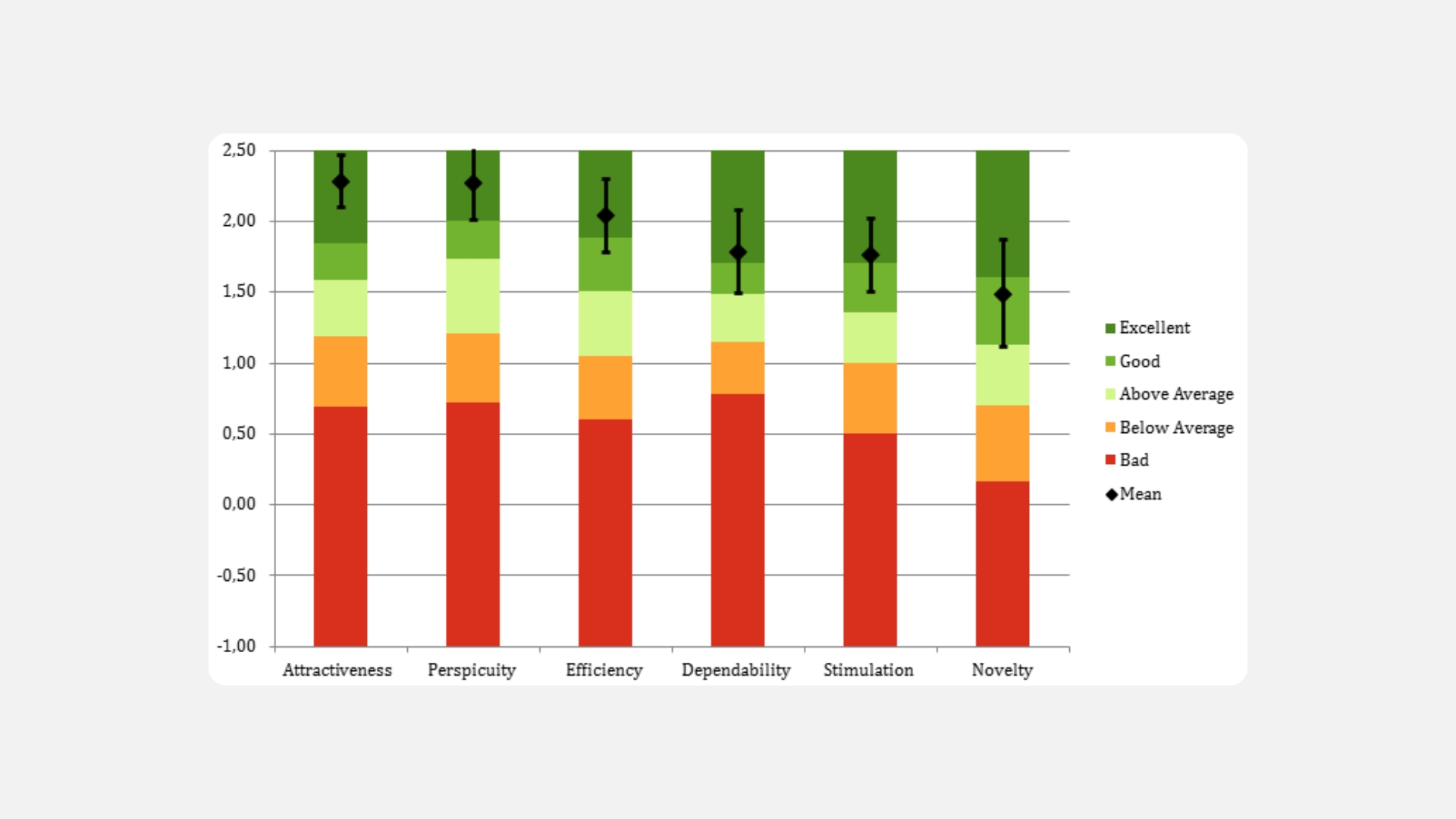
Quantitative Evaluation (UEQ)
- 26 respondents completed the User Experience Questionnaire (6 dimensions: attractiveness, perspicuity, efficiency, dependability, stimulation, novelty):
- Results:
- All dimensions except originality scored excellent (>75% percentile)
- Originality rated above average (50–75%), reflecting the calm and conservative design approach
- Overall: the app meets user needs and delivers a high-quality experience compared to benchmark products.
Results & Impact
Measurable outcomes:
- UEQ scores highly positive across all dimensions.
- 100 % of participants said they would use the app as therapy support.
- Users described the app as calm, clear, and helpful.
Qualitative feedback:
- “I like that I can finally have the exercises and skills with me anytime I want.”
- “I think it could really help me in a crisis – I would definitely use it.”
- “It’s great to track my mood and see my progress.”
Impact:
- Addresses a gap in digital tools for BPD users.
- Applies evidence-based principles to gain trust from users and therapists.
- Shows that simplicity, accessibility, and emotional safety are as crucial as features themselves.
Reflection
Challenges:
- Balancing simplicity and functionality
- Handling a sensitive topic with empathy and careful communication
- Ensuring content credibility based on DBT and research evidence
What I learned:
- Small details matter; even notification wording can shape the user experience
- Less is more; users often need clarity and calm, not more features
What I would do differently:
- Start prototyping earlier and test continuously
- Include therapists in the evaluation as expert stakeholders
This project allowed me to combine research, psychology, and design in a topic of both professional and personal significance. I learned to design with cognitive and emotional specificity in mind, test iteratively, and handle sensitive feedback.
The result is an app design that supports rather than overwhelms—exactly what people with BPD often need. Even as a student project, it opened the door to a deeper interest in digital mental health solutions.